← Return

Plant App

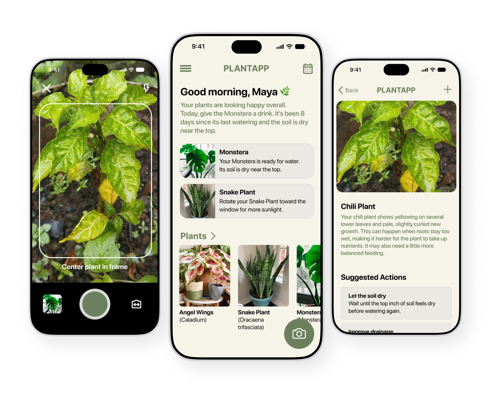
Three smartphone screens showing PlantApp interface: left screen with a camera viewfinder framing a green plant with yellow leaves and text 'Center plant in frame'; middle screen with a greeting 'Good morning, Maya' and care advice for Monstera and Snake Plant, plus thumbnails of Angel Wings, Snake Plant, and Monstera plants; right screen displaying detailed info about a Chili Plant with yellowing leaves and suggested care actions like 'Let the soil dry.'

As a part of my Google UX Design certification, I’ve been working on a design for a fictional plant care app. The goal was to design an app that helps customers diagnose issues with their houseplants. Taking care of plants can be challenging as many problems can arise during their lifetime. I wanted to make it dead simple to diagnose issues.

My Role
UX Design + Research

Timeline
Jun. -  Sep. 2026

Skills
User Research
User Interviews
Journey Mapping
Sketching
Wireframing
Screen Flows
Visual Design
Prototyping
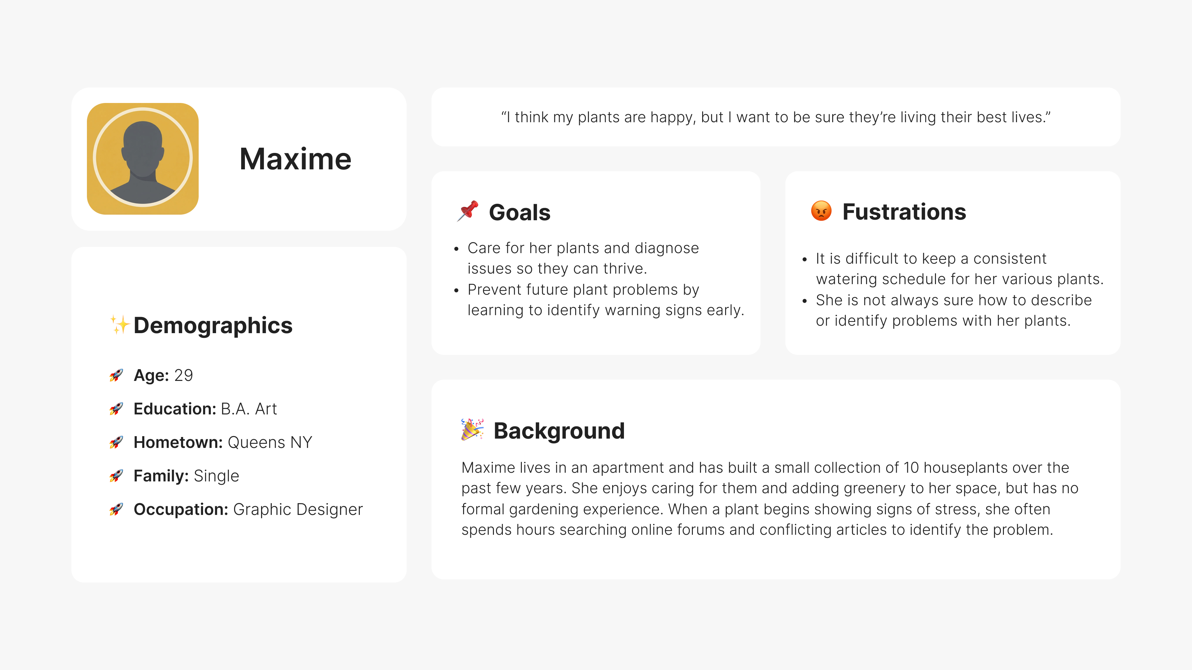
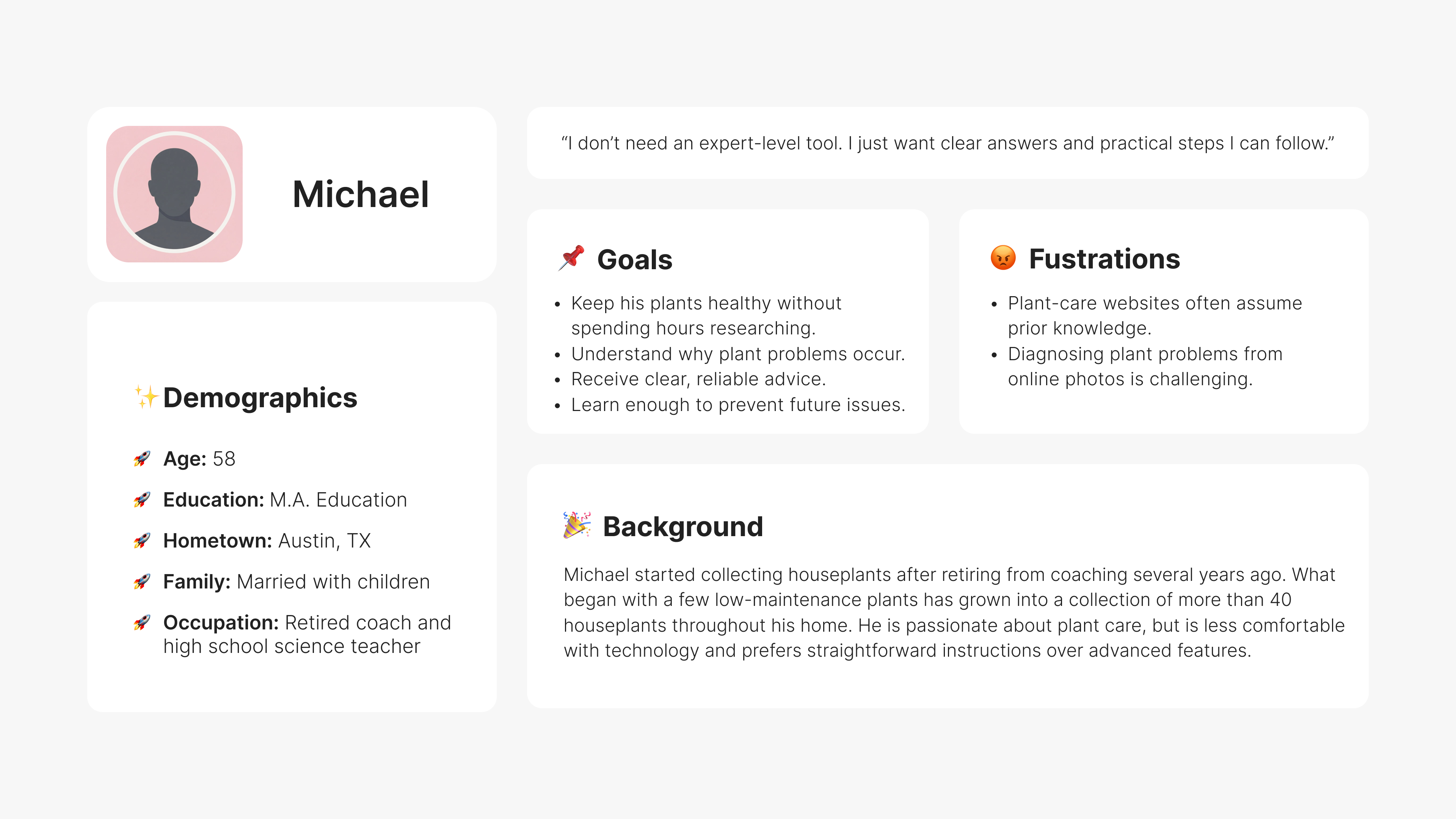
User persona profile for Maxime, a 29-year-old graphic designer from Queens, NY, who is single with a B.A. in Art. Maxime cares for 10 houseplants in her apartment and wants to ensure they thrive. Her goals are to care for her plants and diagnose issues early. Her frustrations include difficulty keeping a consistent watering schedule and uncertainty about identifying plant problems. She spends hours searching online for plant care advice when her plants show stress. The profile includes a quote: 'I think my plants are happy, but I want to be sure they’re living their best lives.'User persona profile for Michael, a 58-year-old retired coach and science teacher from Austin, TX, married with children, with M.A. in Education. Goals: keep plants healthy without extensive research, understand plant problems, get clear advice, and prevent issues. Frustrations: plant-care websites assume prior knowledge and diagnosing problems from photos is hard. Background: Michael started collecting over 40 houseplants after retiring, prefers straightforward instructions over advanced features, and is less comfortable with technology. Quote: “I don’t need an expert-level tool. I just want clear answers and practical steps I can follow.”

Initial Research

I began my research by putting out a survey. It was important to know what kind of relationship a person has with their plant. Something that surprised me was that some people don’t have any plants at all. People chose not to own plants for various reasons like fear of insect infestation. I’ve had this issue in the past, so I totally get that. Plant owners are also frequently frustrated when trying to diagnose problems as advice may be unclear or unfriendly towards beginners.

Pain Points

1. Plant care websites assume you have prior knowledge of how to take care of plants. Some of the technical terminology can be intimidating.

2. Diagnosing problems from photos online can be challenging since a user’s situation may be a unique one.

3. Keeping consistent watering schedules for multiple types of plants can be frustrating and difficult to keep track of.

Design Process

A fundamental part of this course was to learn about the UI/UX design process. This included sketching out "Crazy 8s" by hand, iterating, and finally creating low fidelity wireframes in Figma. This was a great way to try out a ton of ideas and practice thinking more abstractly about the layout of the app.
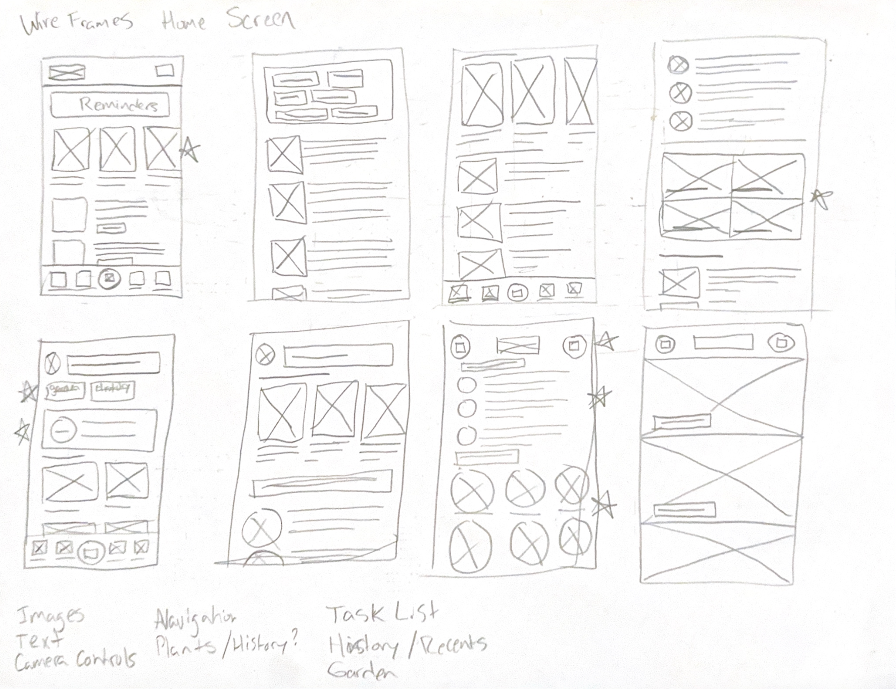
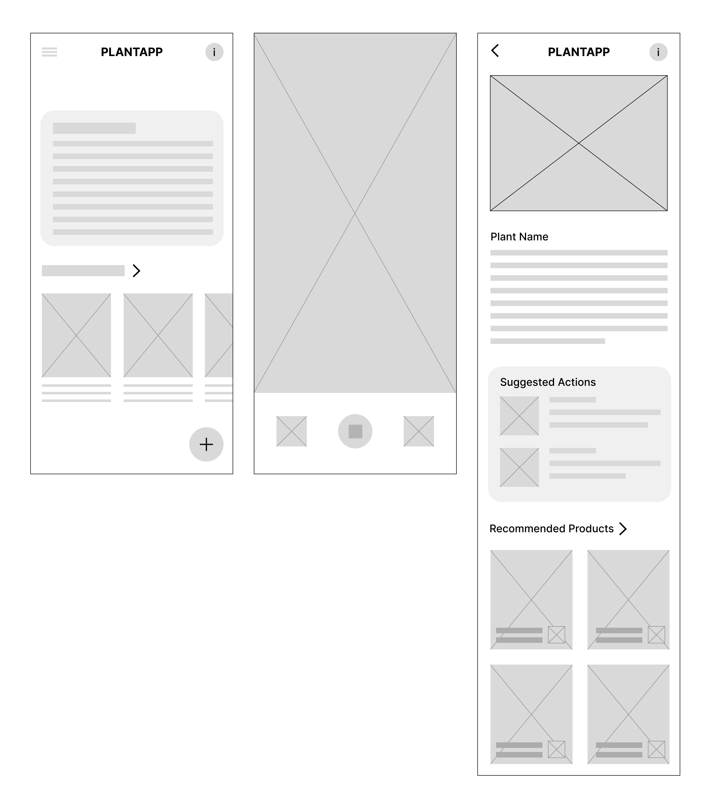
Hand-drawn wireframe sketches of eight different mobile app home screen layouts arranged in two rows of four, featuring placeholders for images, text blocks, buttons, icons, navigation bars, and labeled sections like reminders, task lists, and categories such as garden and history.Wireframe mockups of PlantApp mobile screens: the first screen shows a list with a menu icon, PlantApp title, info button, text block, horizontal scroll of plant items with images and descriptions, plus an add button; the second screen shows a large camera preview area with photo capture and gallery buttons below; the third screen displays a plant detail page with a back arrow, info button, plant image, plant name and description, a section for suggested actions with images and text, and a grid of recommended products with images and brief details.

Informed Decisions

Owning plants doesn't necessarily make someone a plant expert. People have lives and most of the time those lives don't revolve around taking care of plants. I made a choice to present information in a simple, straightforward way. Because of this, I also made the decision to keep iconography to a minimum.

A usability study revealed that users wanted a confirmation screen during the scanning flow, as well as the ability to scan plants consecutively.
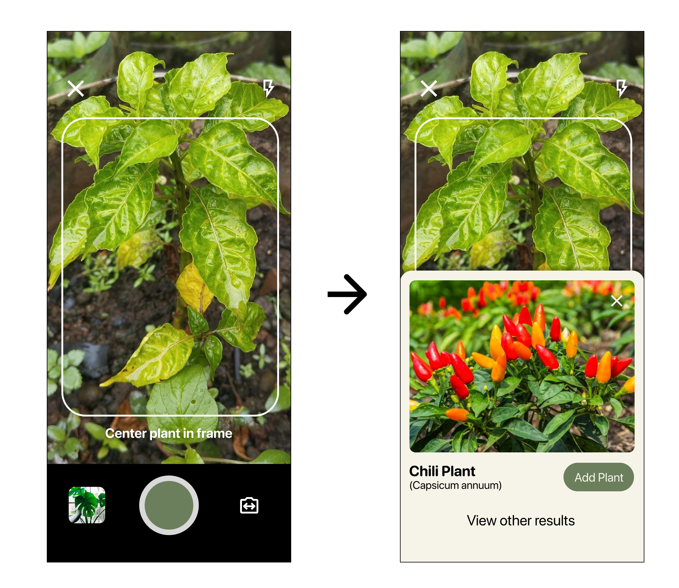
Two screenshots showing a plant identification process on a mobile app: left, a green leafy plant centered in a white frame with instructions to center the plant; right, the identification result showing an image of a chili plant with red and yellow chili peppers, its name (Chili Plant), scientific name (Capsicum annuum), an 'Add Plant' button, and an option to view other results.
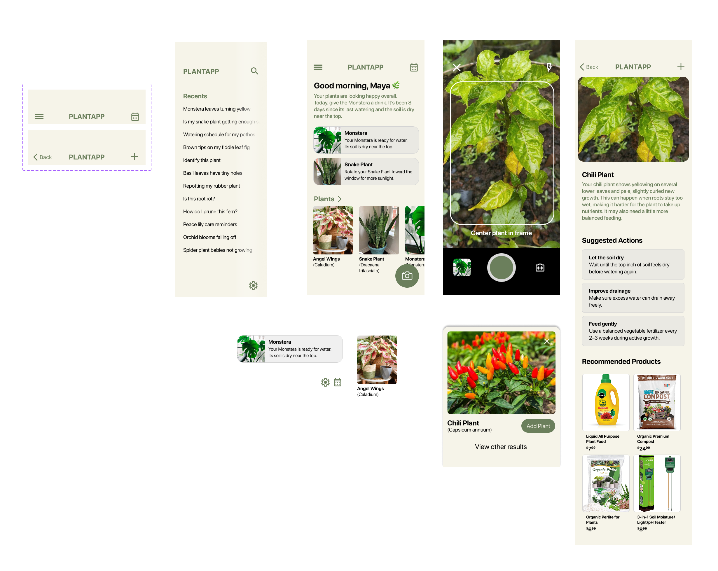
User interface mockup of PlantApp showing multiple screens: a menu with plant care questions, a home screen greeting user Maya with Monstera and Snake Plant care tips and thumbnails of plants, a camera screen for centering a plant for identification, a detailed plant info page for a yellowing Chili Plant with suggested actions and recommended products, and search results with a Chili Plant image and add button.

“I love how simple and straightforward this is. The app provides solutions in an easy to understand format.” - User Study Quote
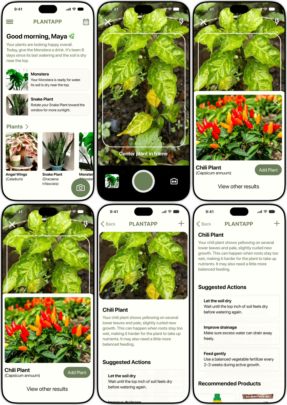
Mobile app screen for PlantApp showing a morning greeting to Maya with a leaf emoji, advising to water the Monstera plant due to dry soil after 8 days, and suggesting rotating the Snake Plant for more sunlight. Below, images of plants Angel Wings (Caladium), Snake Plant (Dracaena trifasciata), and Monstera are displayed with their names, plus a camera button in the bottom right corner.

The Outcome

Since this was a fictional app coinciding with the Google UX Certificate, I learned best practices and most importantly, the process to create a product from just an idea. The biggest takeaway for me was all of the research and data analysis that takes place at the start of a project. Practicing these methods has shown me how important these early steps are to creating a product.

Next Steps

I would incorporate a speech to text method of plant analysis where a user could describe their issue instead of taking a photo. This would be useful for people that may not have their plant readily accessible or are using a device that has a broken camera. I would also add in a calendar view to view upcoming tasks so a user can plan ahead. This can help users anticipate any maintenance instead of having it presented the day of. Additionally, I would consider adding additional iconography to give users a quicker way to identify recommended actions in the UI.

Andrew Timosca

EmailLinkedInResume